I've been a working designer since 2014, on my own and as co-founder of Huntsville Design House, a full-service marketing agency. Most of my work turns research data, technical processes and scientific claims into reports, infographics, presentations and print pieces that people actually read, built to each client's brand standards and ready for production.
An ill-designed (or sometimes, just plain ugly) piece of content makes people question an organization's attention to detail. My job is to make complicated information clean, accurate and easy to understand, and to deliver it on schedule, every time.
Research studies, benchmark reports and case studies up to 30+ pages, built on consistent templates so every page belongs to the same document.
Charts, stat callouts, comparison grids and process flows that make dense numbers easy to scan.
Executive PowerPoint decks, org charts, process flows and maps that make complex structures easy to follow.
Print-ready files for trifolds, posters, 18 × 24 large-format pieces, stationery and merch, set up to the printer's specs, bleed and fold layout.
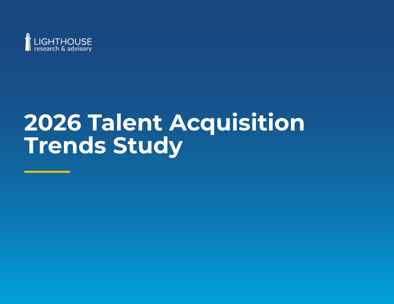
Lighthouse is an HR and talent research firm whose surveys reach thousands of HR leaders and employees. Their product is data, so every deliverable has the same challenge: present dozens of findings clearly enough that a busy executive can get the point in a skim, while still holding up to a careful read. I design their research reports, co-branded studies, infographics, case studies and print collateral on an ongoing basis.
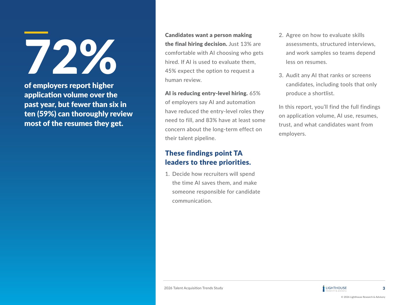
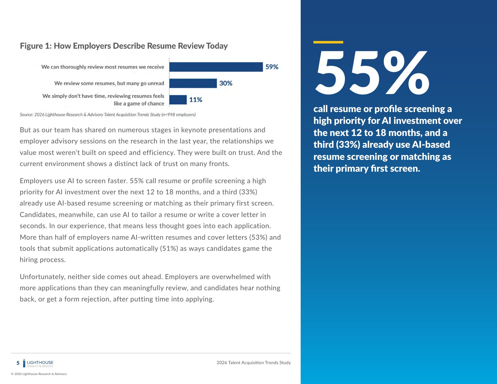
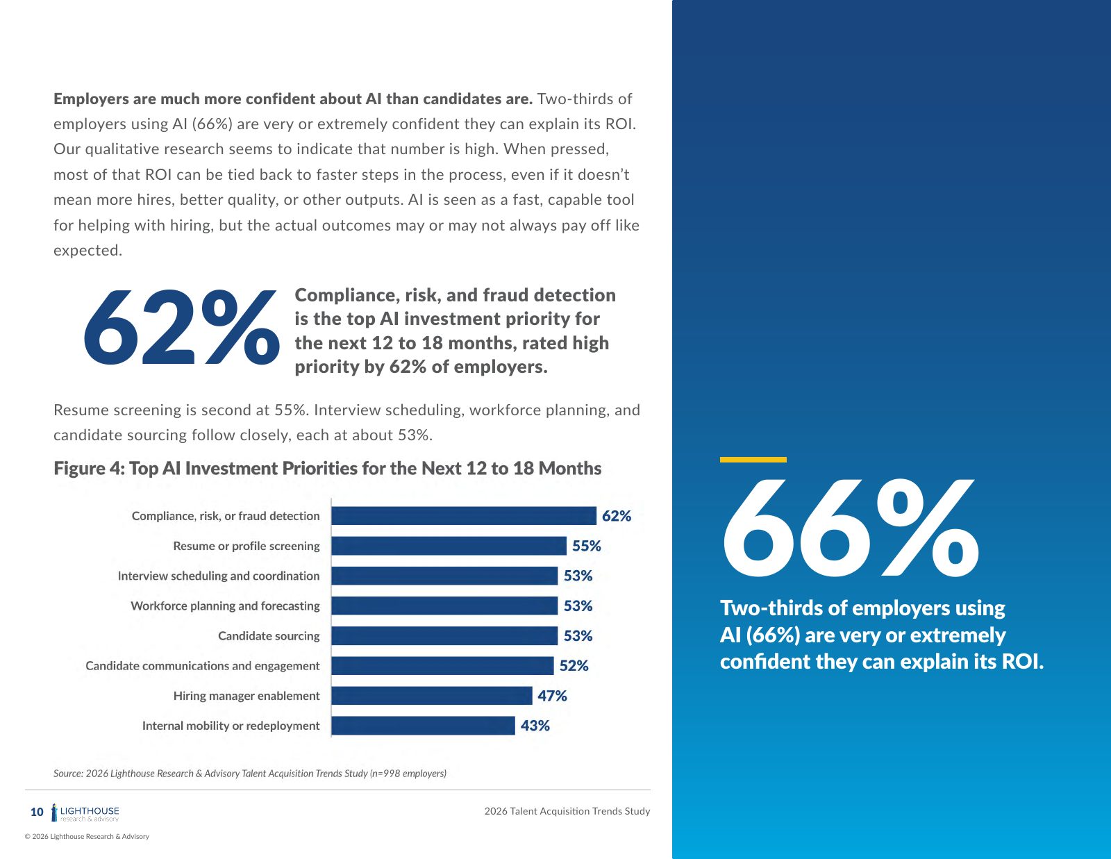
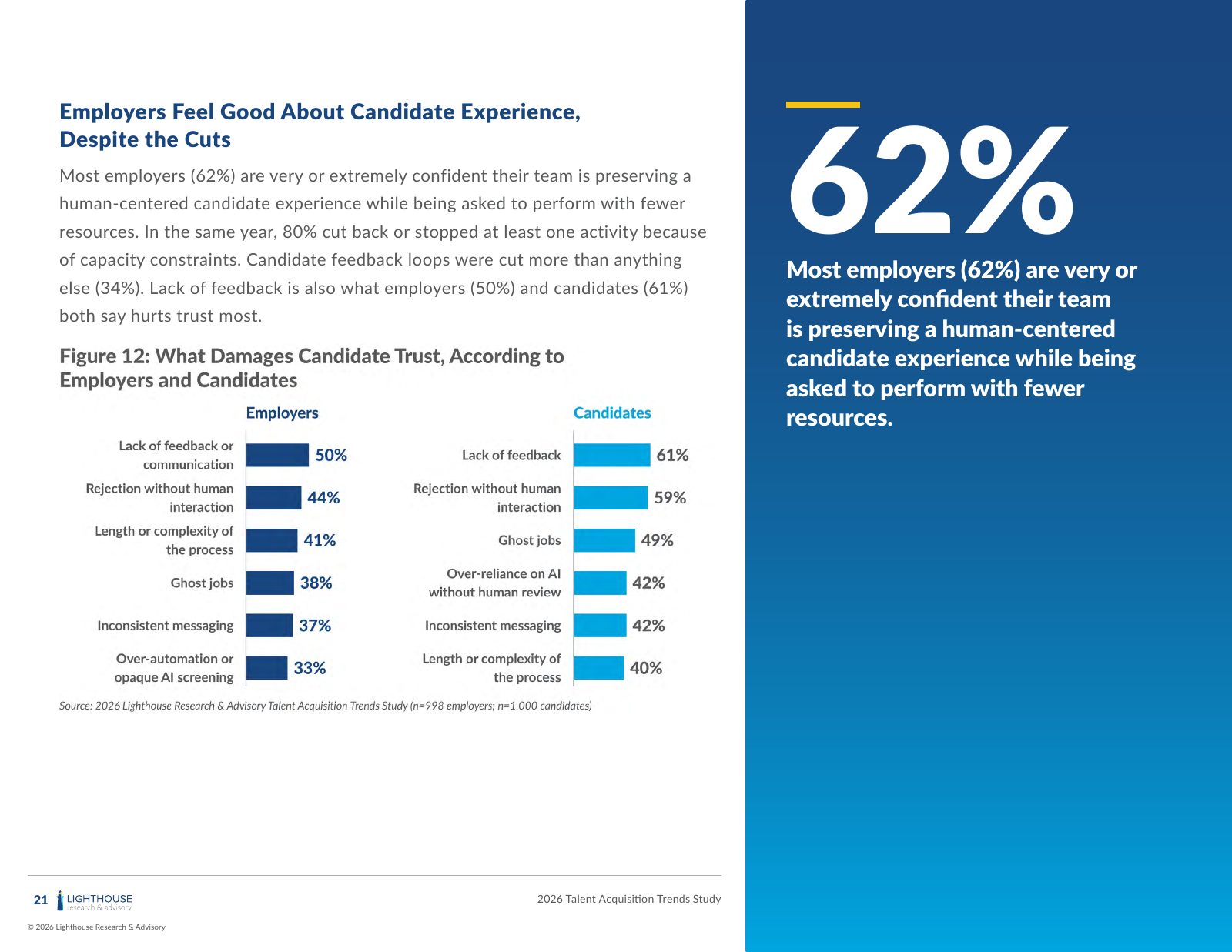
The objective: turn a large survey of employers and job candidates into a flagship report that HR leaders will actually read through to the recommendations.
What I did: designed a landscape layout system with two reading speeds. A full-height blue sidebar carries one oversized stat or takeaway per spread for skimmers, and the main column holds the analysis. I built more than a dozen numbered figures (bar charts, comparison charts and side-by-side employer vs. candidate views) with consistent styling and source lines, plus section openers, pull quotes, and author and company pages.
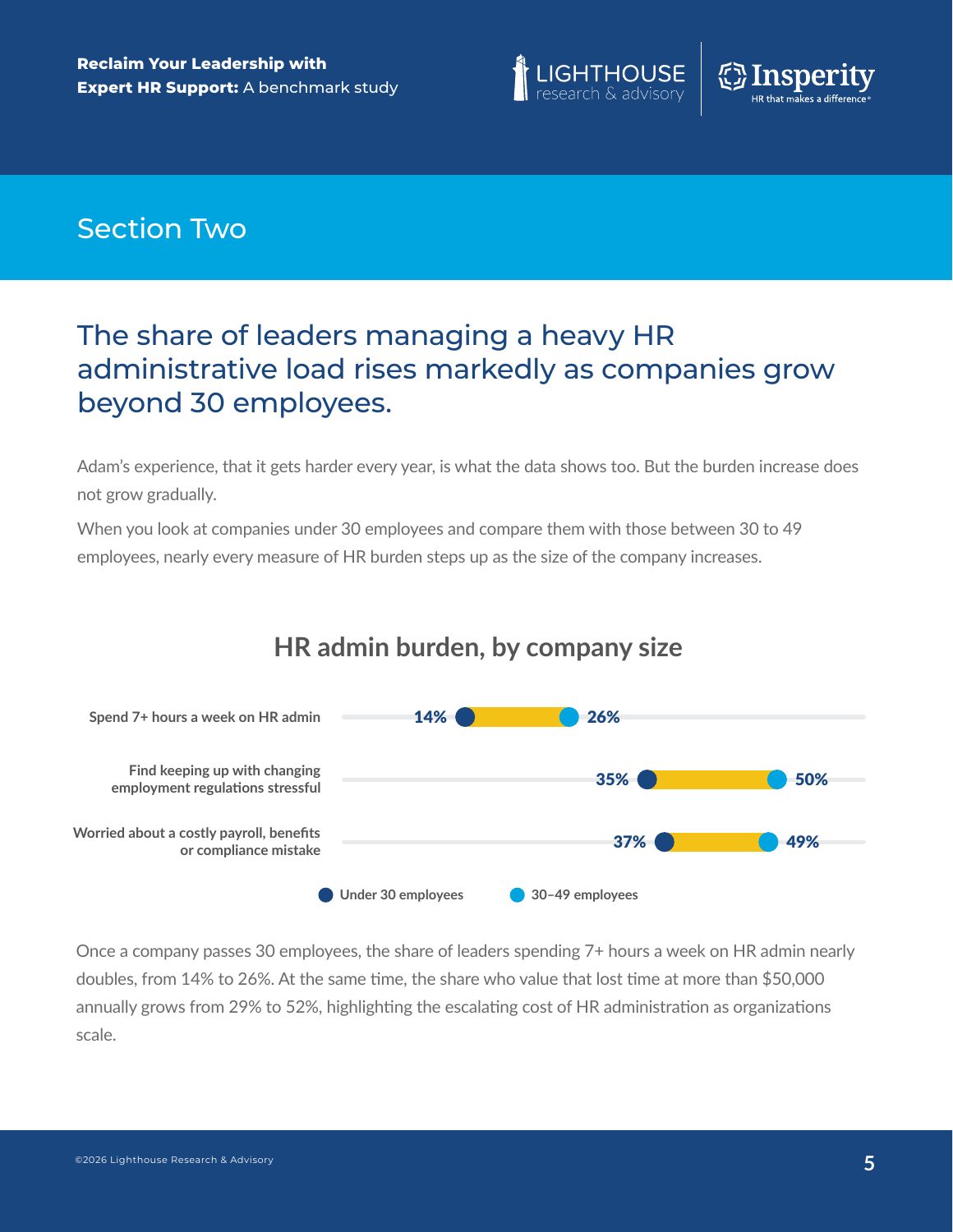
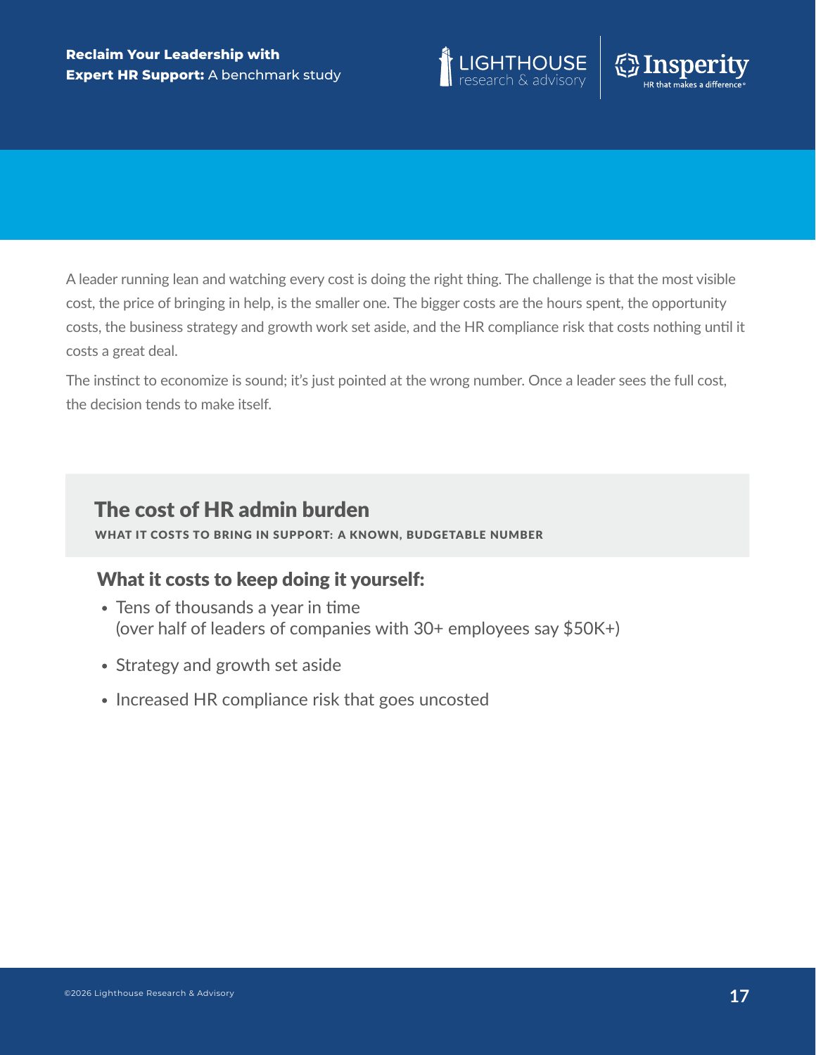
The objective: a benchmark study on the hidden cost of running HR in-house at small businesses, co-published with Insperity. It had to carry two brands without either one overpowering the other.
What I did: set up a dual-logo header and a six-section structure with color-coded section bars. Findings are broken out by company size in charts, highlighted callout boxes and pull quotes from real business leaders. The closing summary table distills the whole report into five cost dimensions on one page, which is the page most readers will screenshot.
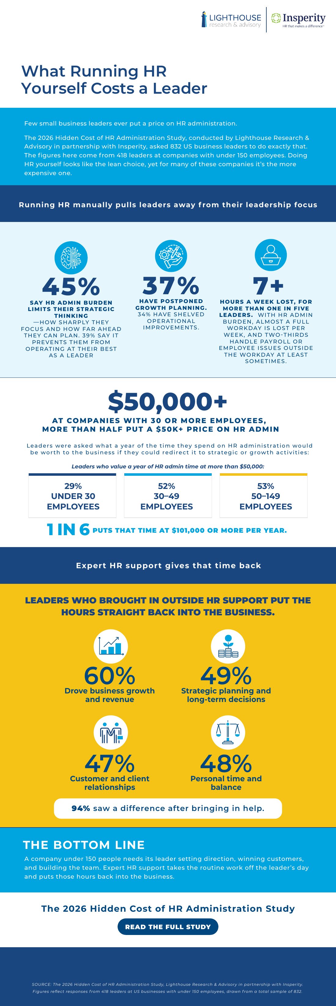
The objective: give the benchmark study shorter, shareable formats for social, email and sales follow-up.
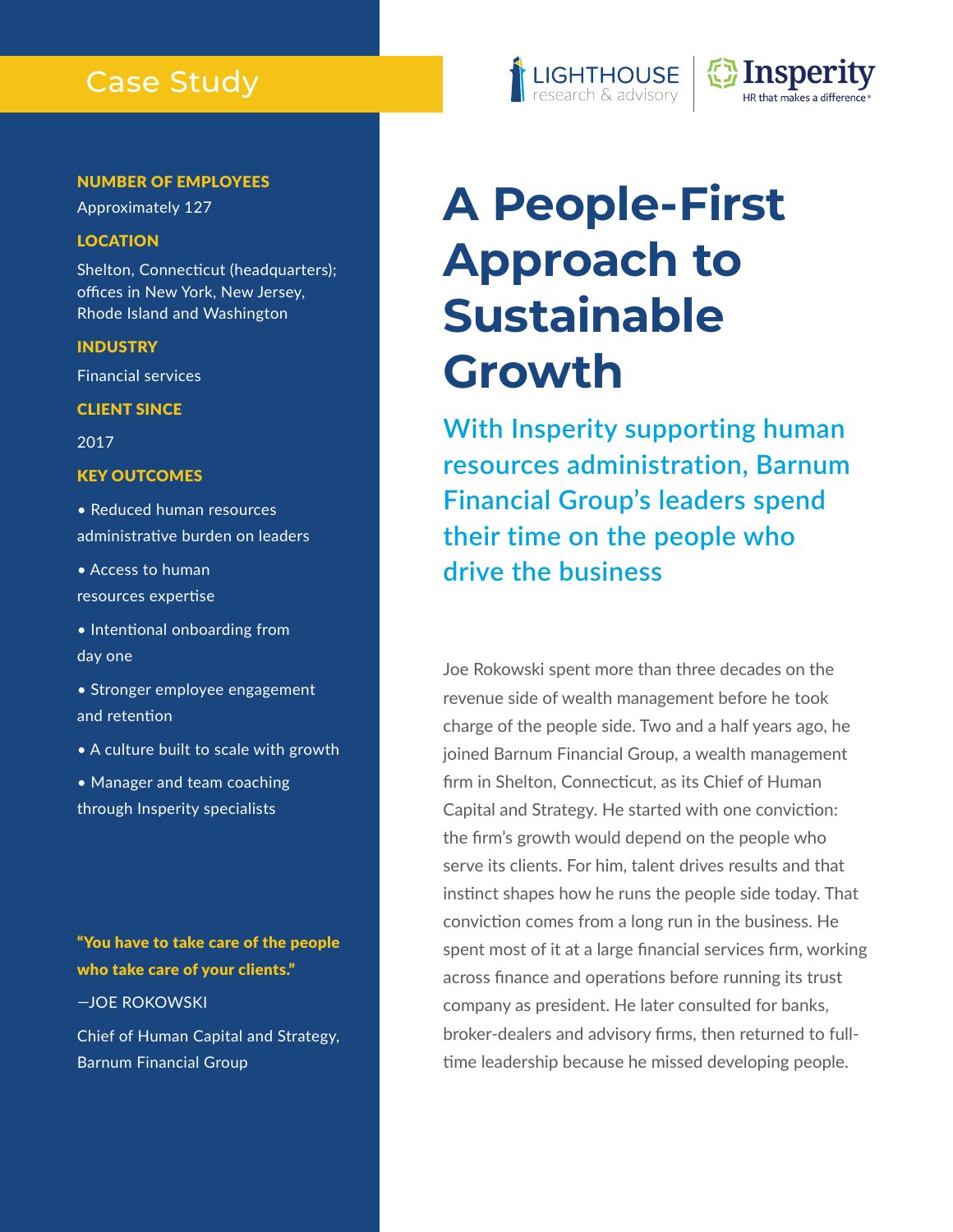
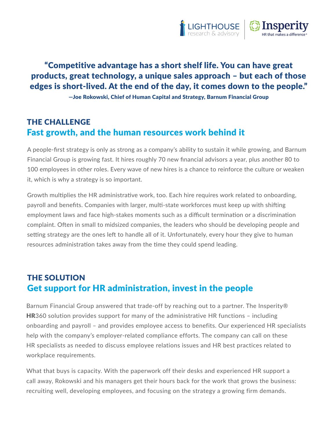
What I did: condensed the 24-page report into a single scrolling infographic with a clear hierarchy: headline stats, a cost-by-company-size comparison, an icon-led results section and a one-sentence bottom line. For the companion case study on Barnum Financial Group, I built a challenge, solution and results structure with an at-a-glance fact sidebar (employees, location, industry, key outcomes) so a reader gets the story before reading a single paragraph.
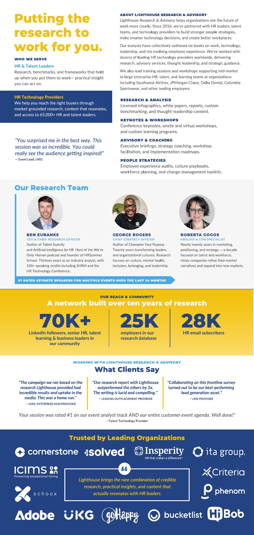
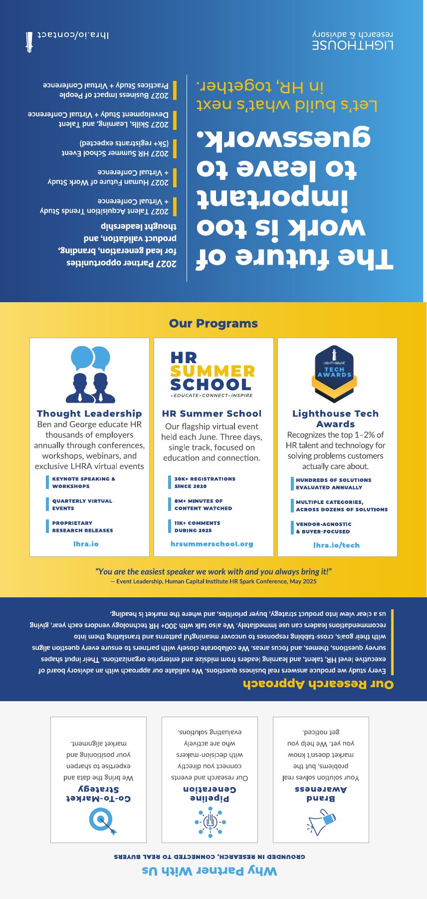
The objective: a printed leave-behind for conferences and sales meetings that covers the whole company: who they serve, their programs, the research team, their reach and the clients who trust them.
What I did: designed a vertical trifold where each panel works on its own and as part of the open spread. The outside sheet is imposed for the fold, so panels sit rotated and in sequence on the press sheet and read correctly once folded. Stats, client quotes and a logo wall give the proof points room to breathe in a small format.
Aviagen is a global poultry genetics company headquartered in Huntsville. The audiences are specialists: producers, veterinarians, live production managers and a large hourly workforce. My work for them falls into two groups: technical sales and field tools that translate trial data and husbandry specs, and internal HR communications that have to land with every employee, in more than one language.
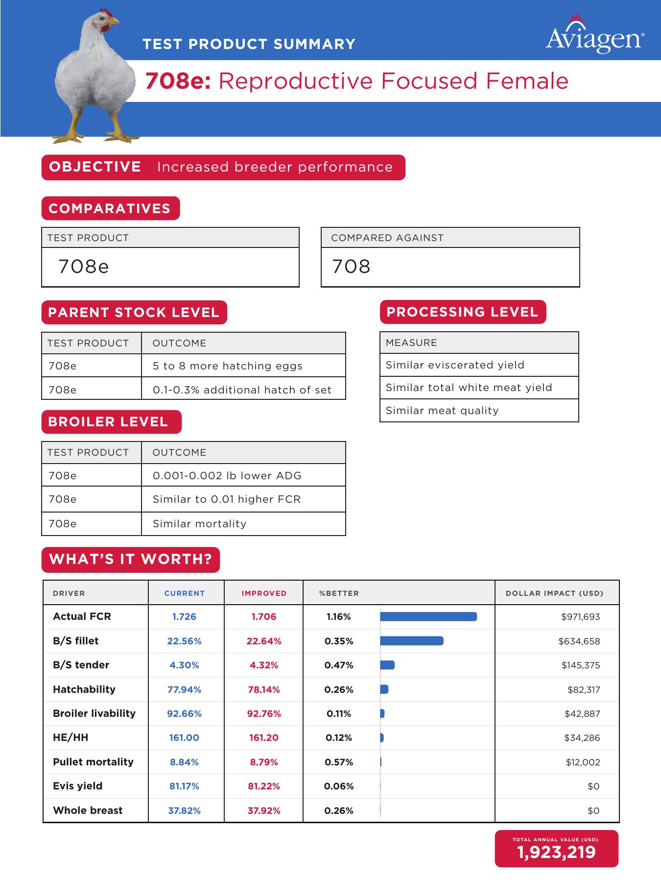
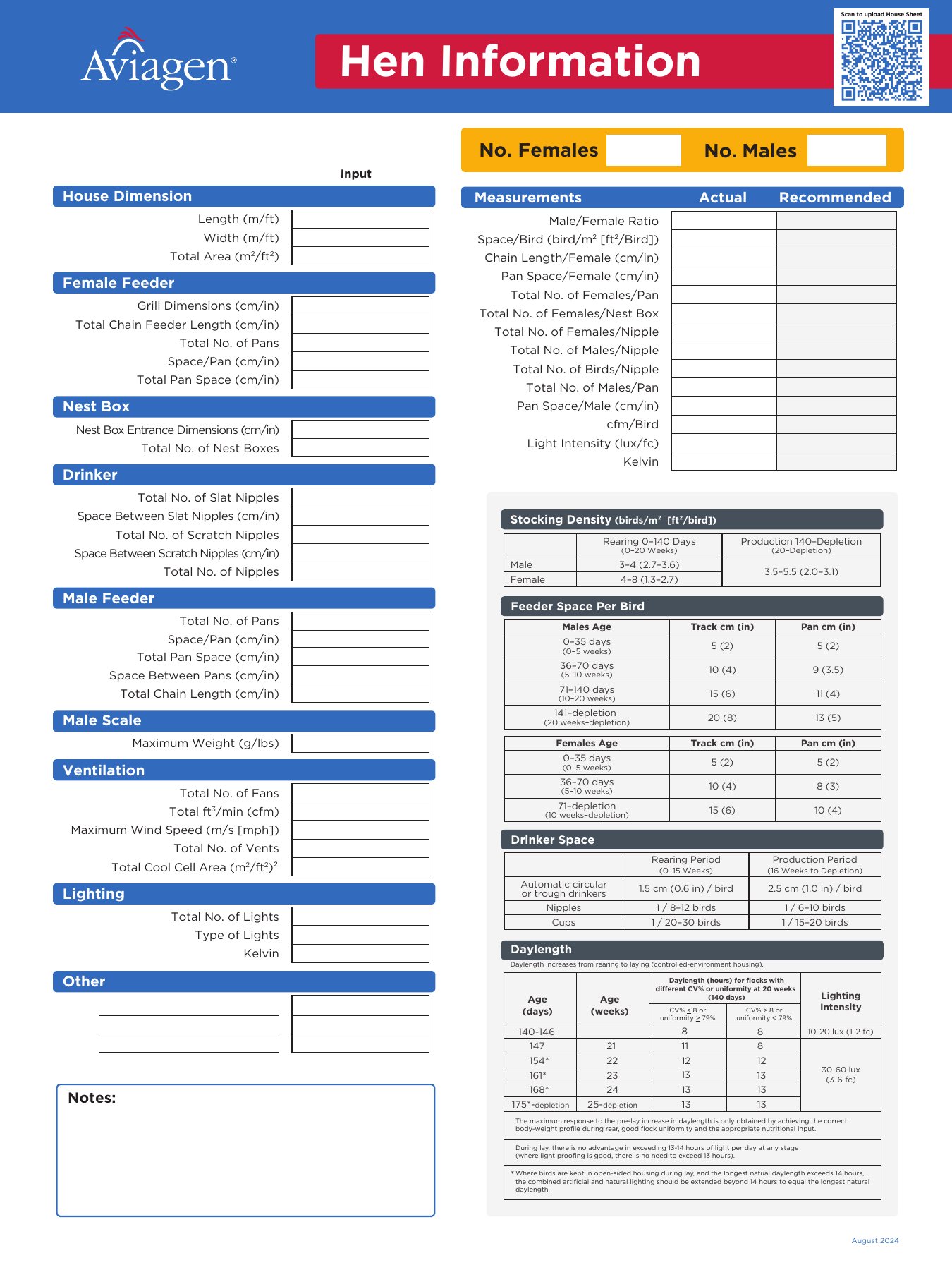
The objective: two tools for the technical sales team. The first summarizes a genetic product trial for customers. The second is a sheet field staff use to record a flock's house setup and check it against recommended standards.
What I did: the product summary walks from objective to results at three levels (parent stock, broiler and processing) and ends with a “What's it worth?” table. It pairs each performance driver with a bar chart and its dollar impact, then totals the annual value, so scientific data becomes a business case. The field form arranges dozens of inputs (feeders, drinkers, ventilation, lighting) in color-coded groups beside the reference tables a technician needs to compare against, with a QR code linking to upload instructions.
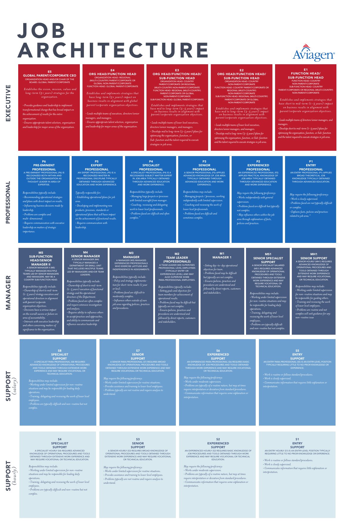
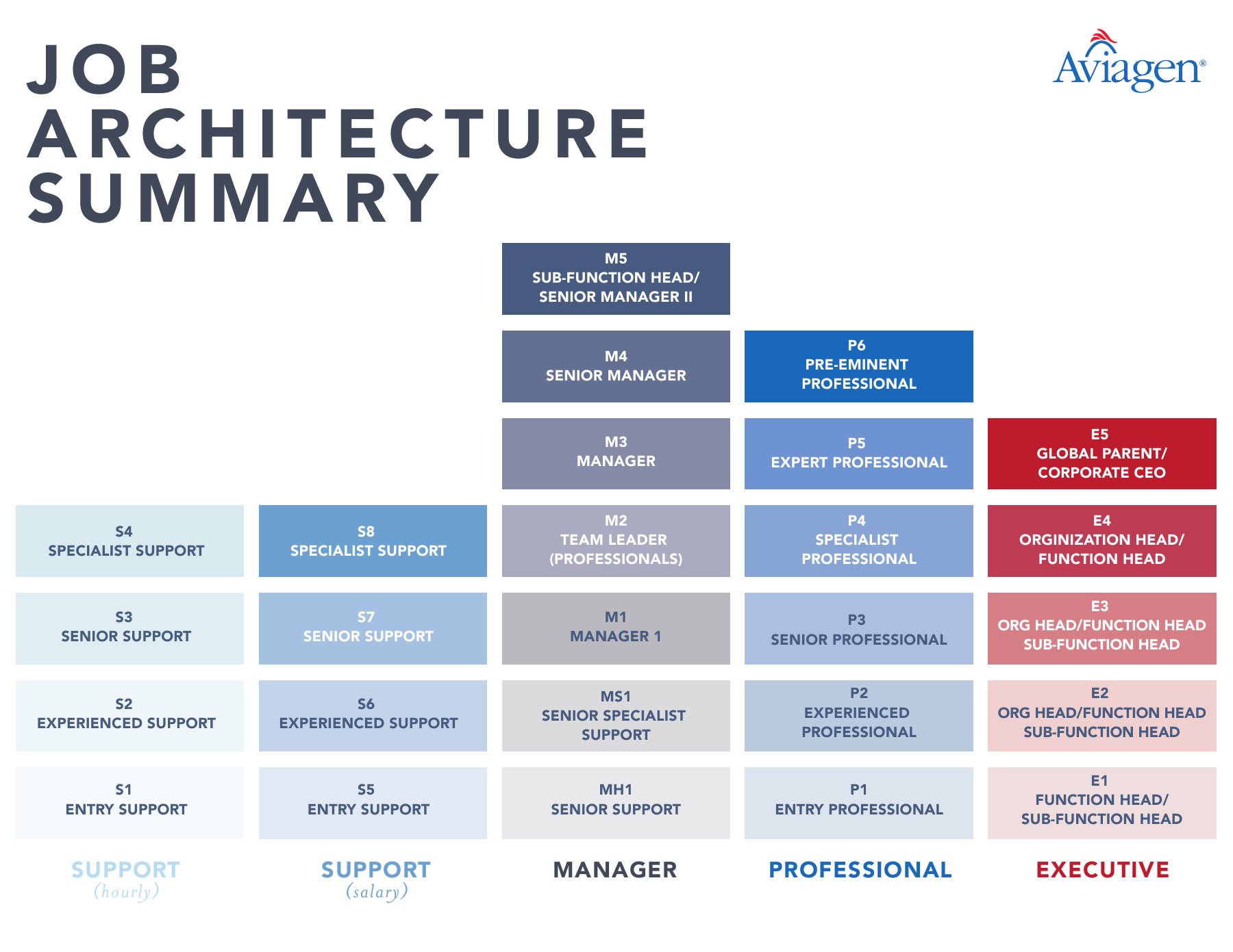
The objective: show the company's entire career framework (every track, every level and how they relate) in a form employees and managers can actually navigate.
What I did: built a tiered diagram with five color-coded tracks (executive, professional, manager, and support for salaried and hourly roles), stepping from entry level up so the path between levels is visible at a glance. The detailed version holds the definition for each level. The summary strips it to codes and titles for quick reference on a wall or in a meeting.
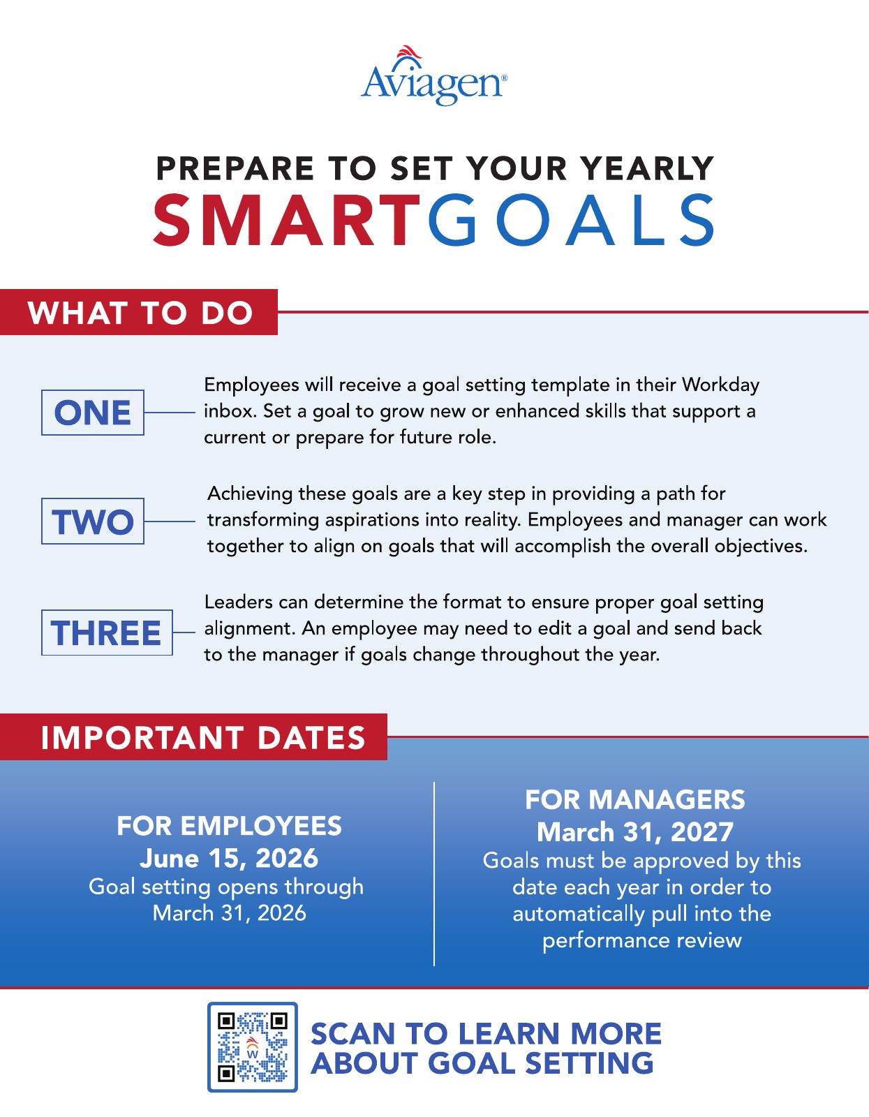
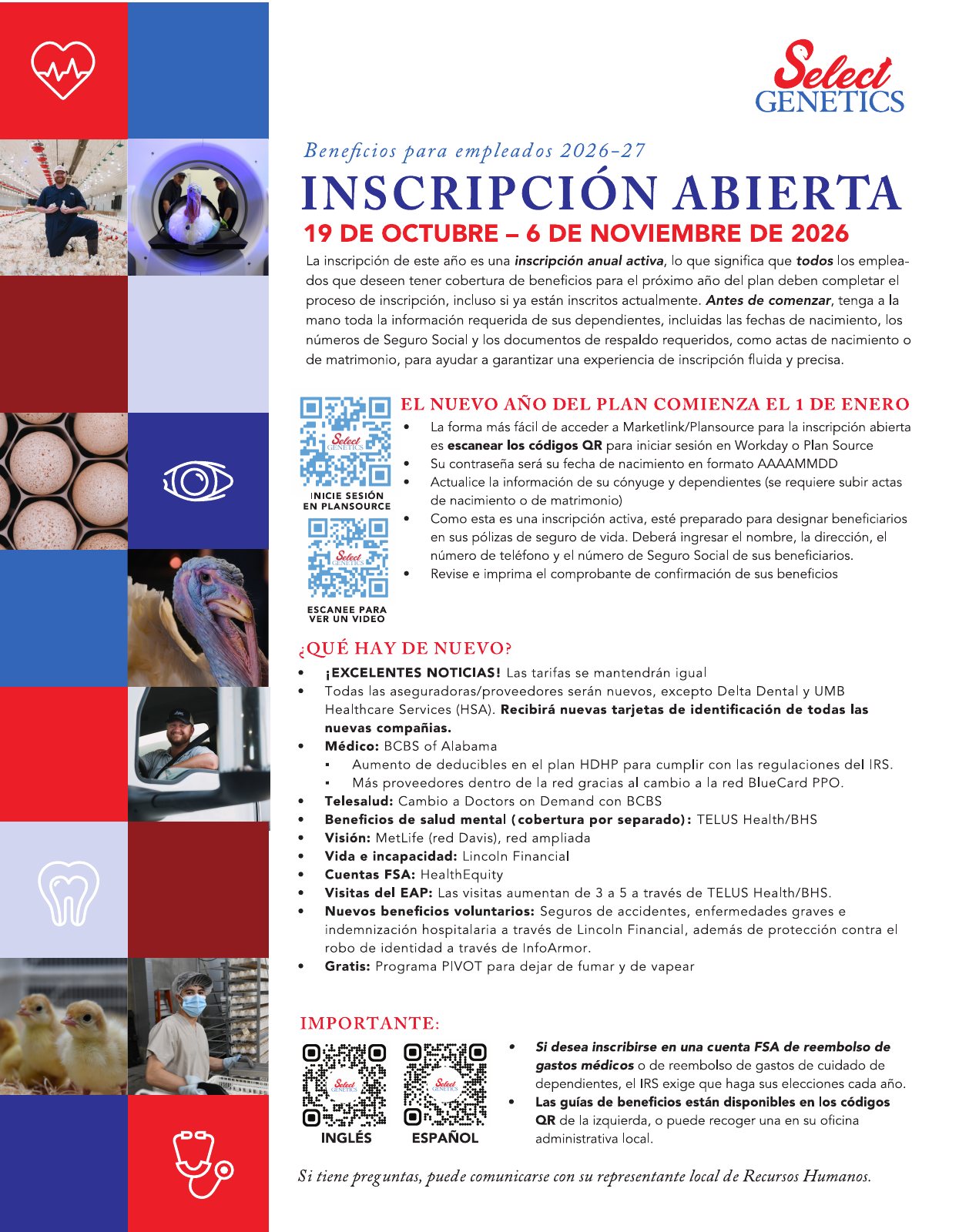
The objective: get time-sensitive HR information in front of a workforce that is often on the farm or plant floor, not at a desk.
What I did: designed posters that answer “what do I do and by when” before anything else. The goal-setting poster breaks the process into three numbered steps with deadlines in a high-contrast band. The open enrollment poster, the Spanish-language edition of a campaign for Select Genetics, leads with the enrollment dates, uses QR codes for sign-in and video help, and organizes plan changes into a scannable list. Both are set up print-ready with full bleed.
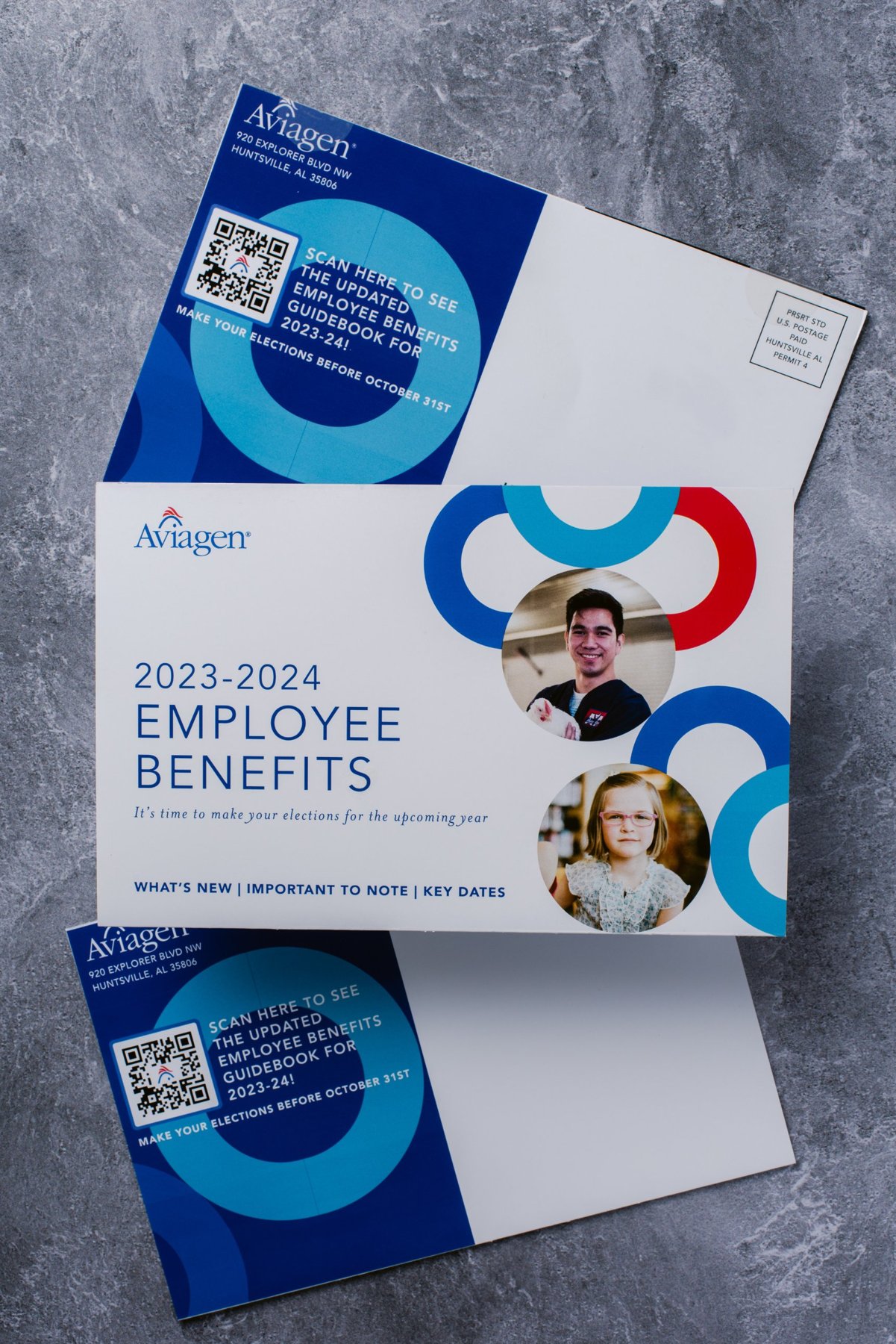
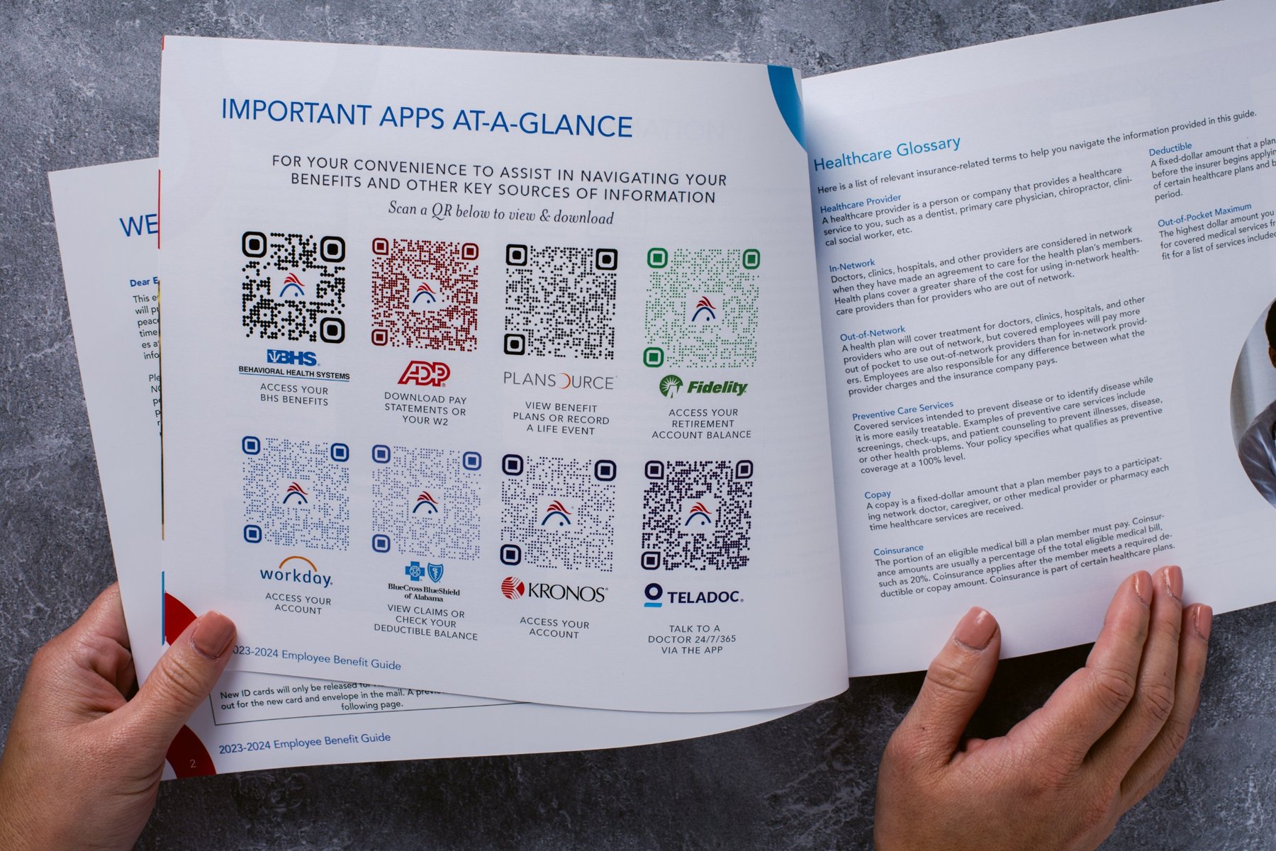
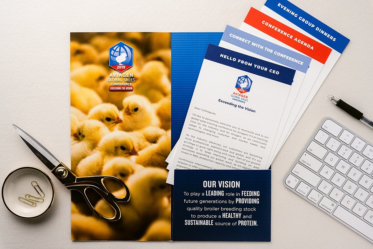
The objective: two printed programs with a lot of moving parts. The first is an annual benefits enrollment campaign mailed to every employee's home. The second is an information kit for international attendees at Aviagen's Global Sales Conference in Huntsville.
What I did: for benefits, I designed a postal-compliant self-mailer with a QR code to the online guide and the enrollment deadline up front, plus a printed employee benefits guide. The guide includes an “apps at a glance” page with eight branded QR codes for the benefits platforms, and a plain-language healthcare glossary. For the conference, I created the event identity and a pocket folder with stepped, color-tabbed insert cards (welcome letter, agenda, networking and dinners), so attendees can find each section without pulling everything out.
SAM Nutrition is a Minnesota-based importer of animal health and feed ingredients. Their sales story is technical: biosecurity, import compliance, lab testing and global logistics. Their audience is feed manufacturers, producers and buyers who want proof before they trust a supplier. My job was to make that proof easy to see.
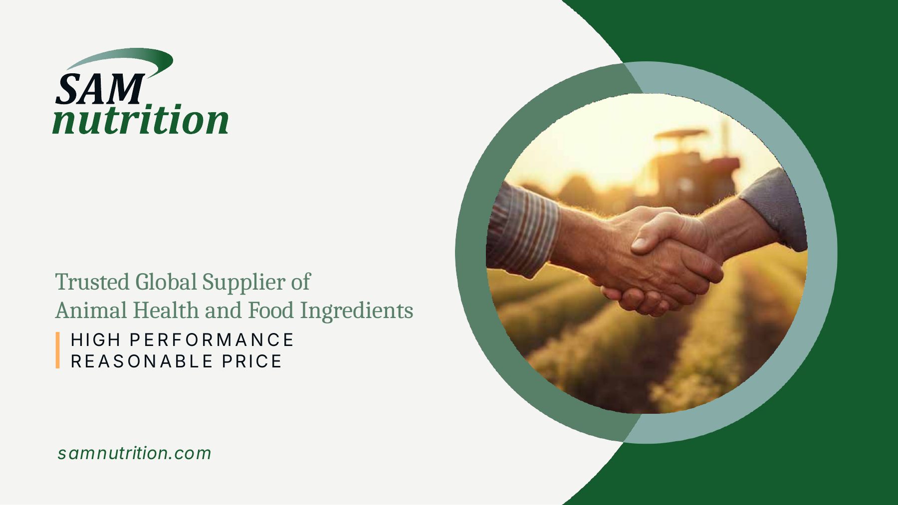
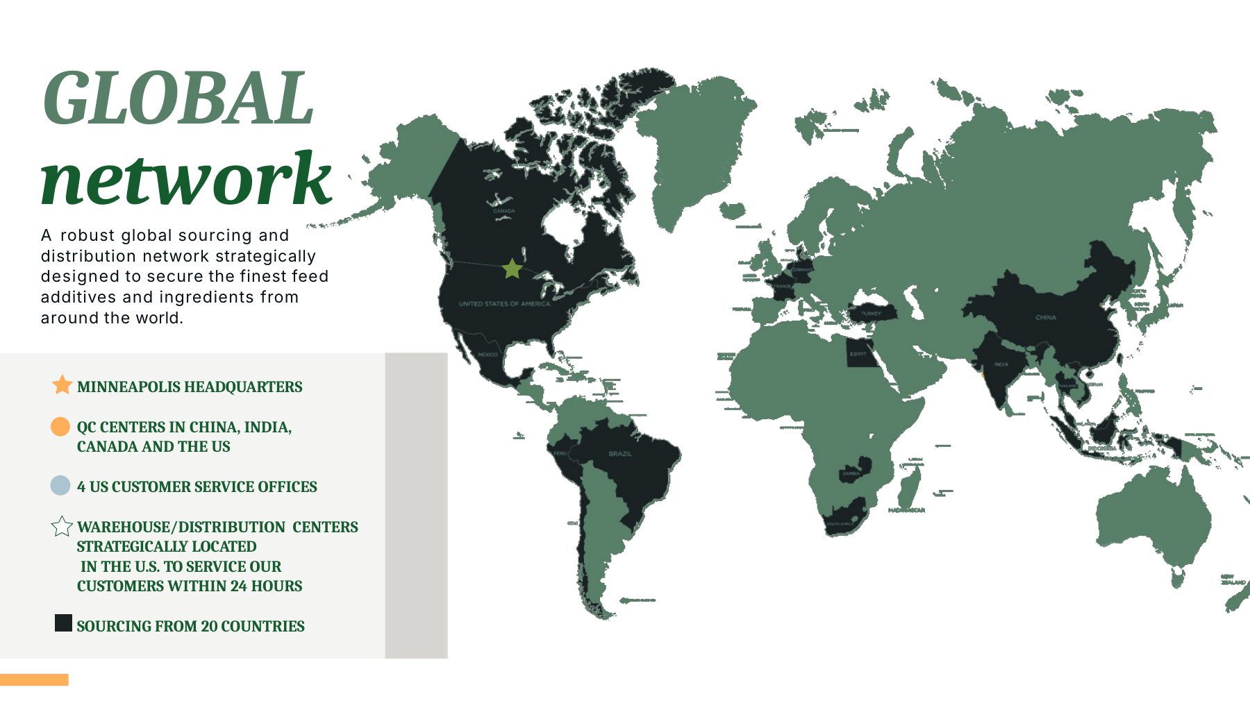
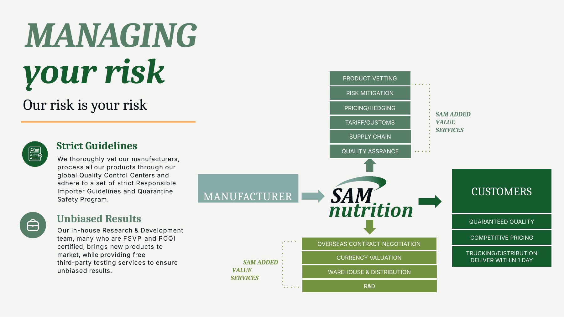
The objective: give the sales and leadership team one presentation that covers who SAM is, how they reduce risk for customers and why that matters, without turning into a wall of bullet points.
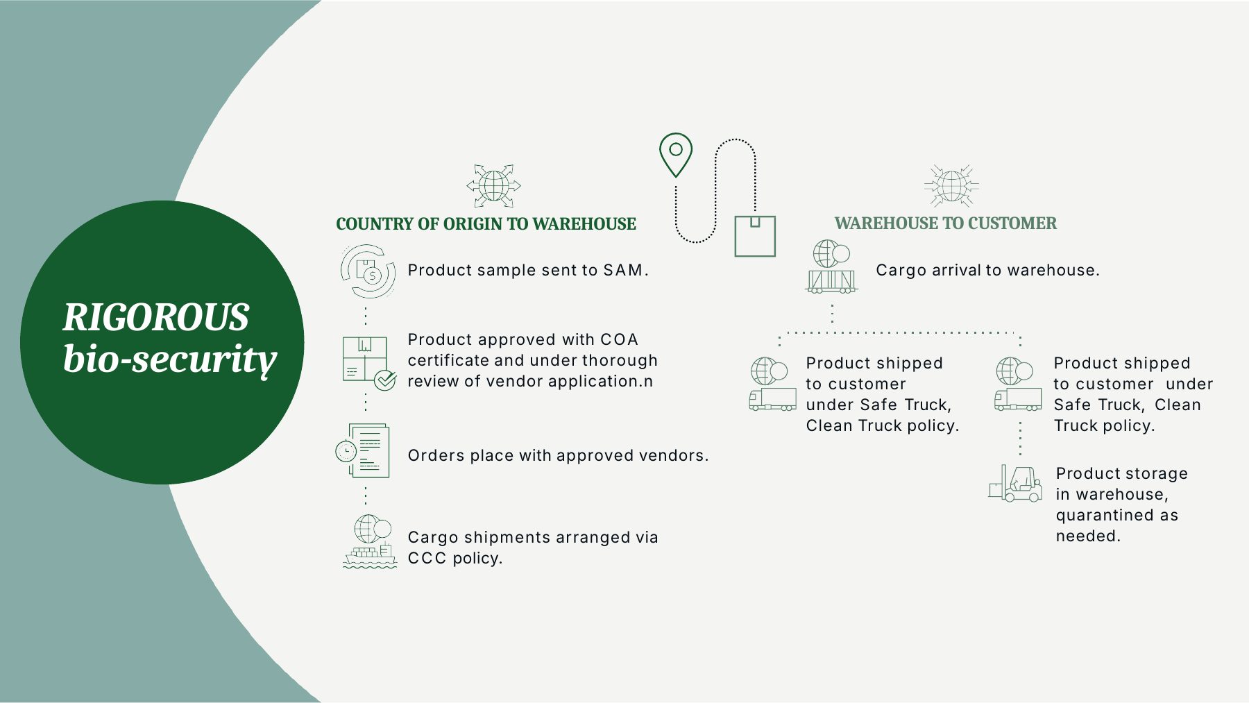
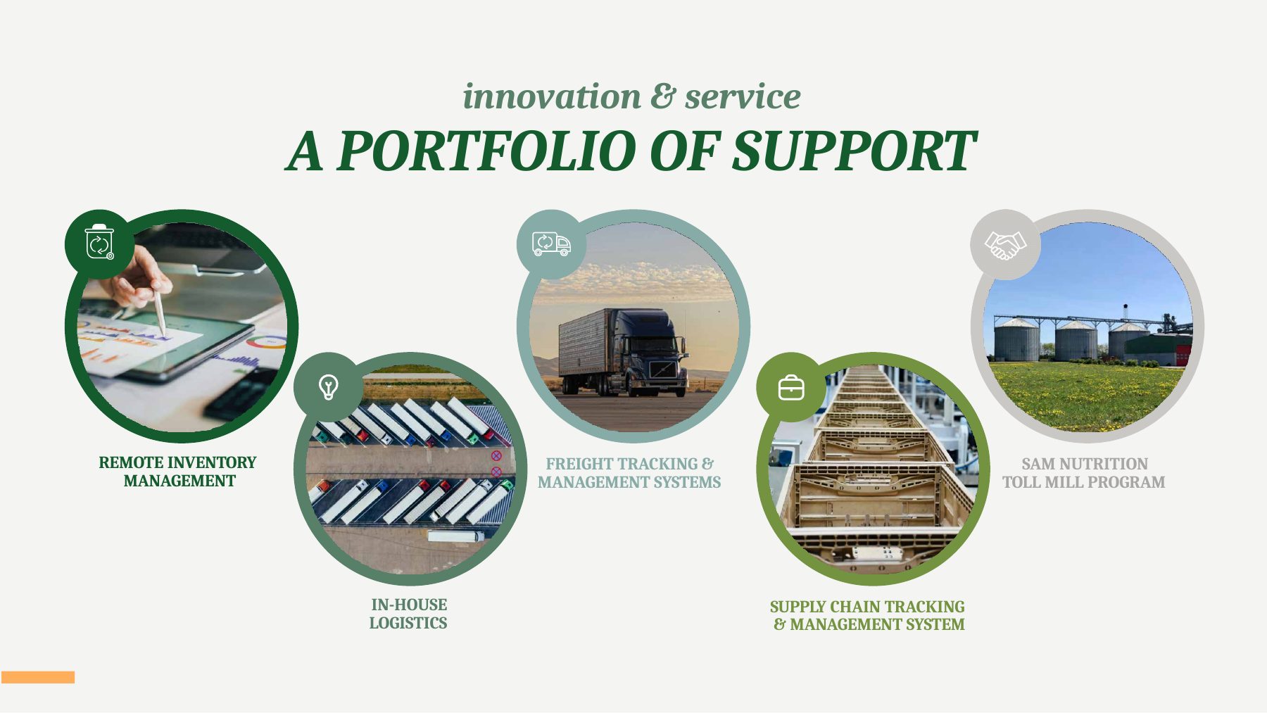
What I did: designed every slide around one idea and one visual anchor. I built a consistent system of circle-cropped photography, a custom icon set, maps of their global network and Canadian expansion, a supplier comparison table and a step-by-step biosecurity flow. I delivered it as a native PowerPoint file so their team can update figures and swap content themselves.
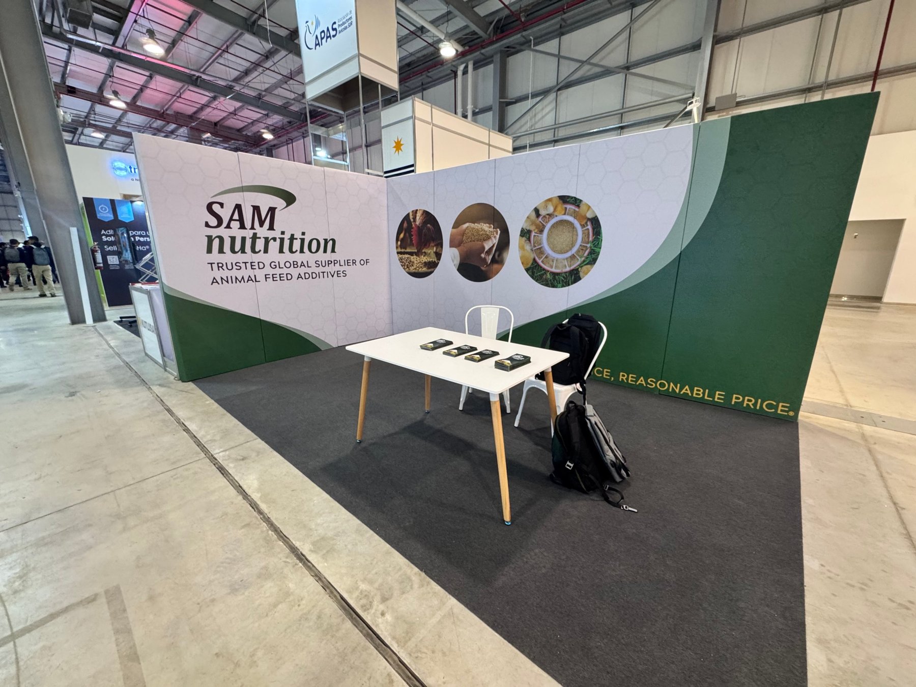
The objective: a booth that identifies SAM from across a busy expo hall and still looks like the same company as the deck, cards and sales sheets once a visitor walks up.
What I did: scaled the brand system up to a multi-panel backwall: a logo and positioning line at eye level, circle-cropped product photography across the corner, the green wave and honeycomb texture running continuously across panel seams, and the tagline along the base of the return wall. I set the artwork up as separate print panels so the graphics line up across every seam once the booth is assembled.
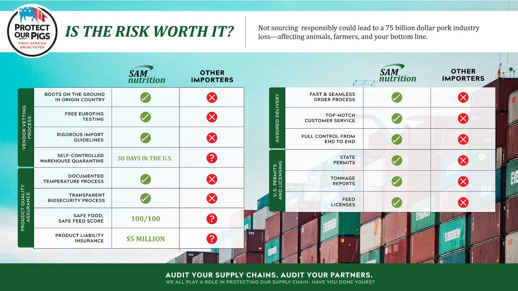
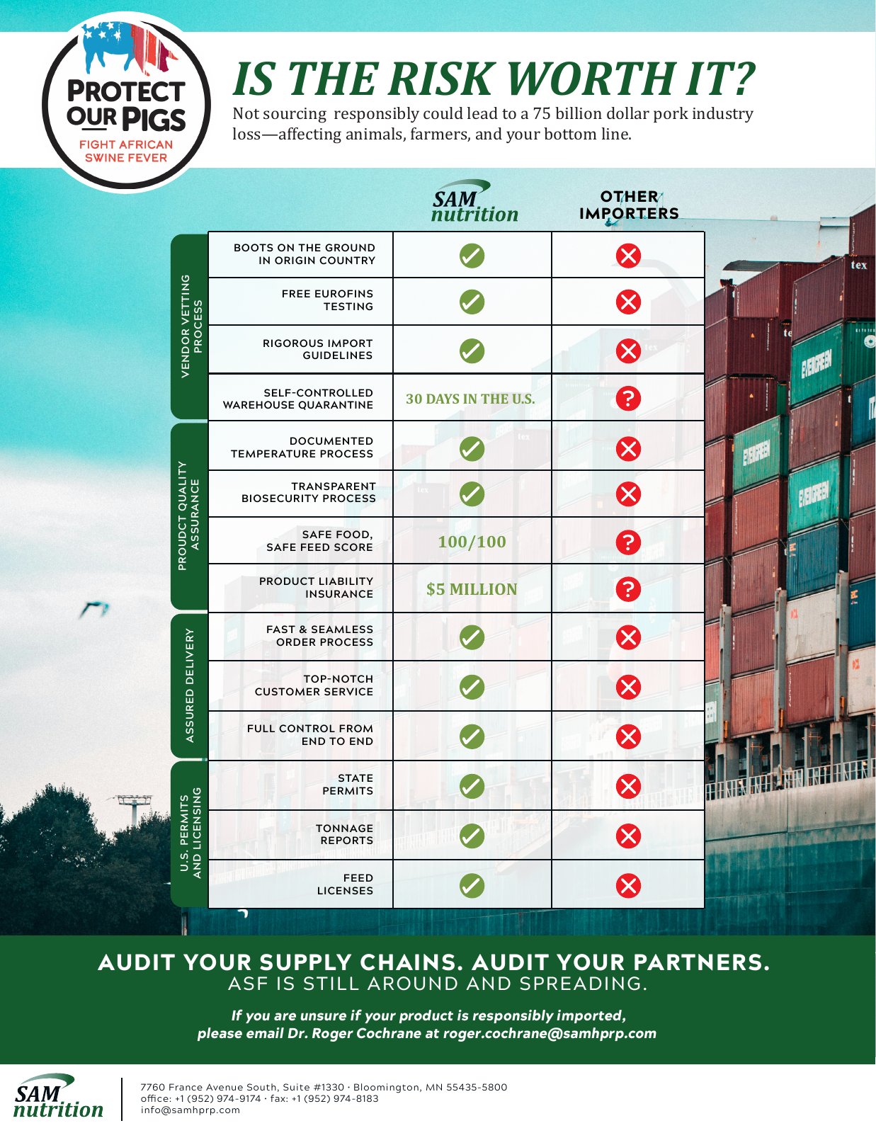
The objective: show buyers, in a few seconds, why responsible sourcing matters for preventing African Swine Fever, and how SAM's import process differs from other importers.
What I did: organized 14 criteria into four categories (vendor vetting, product quality assurance, assured delivery, and U.S. permits and licensing) and set them in a check/X comparison grid against the competition. Where a checkmark undersold the point, I swapped in hard numbers: $5M liability coverage, a 100/100 safety score and a 30-day U.S. quarantine. The piece ties into the industry's “Protect Our Pigs” campaign and closes with one clear call to action.
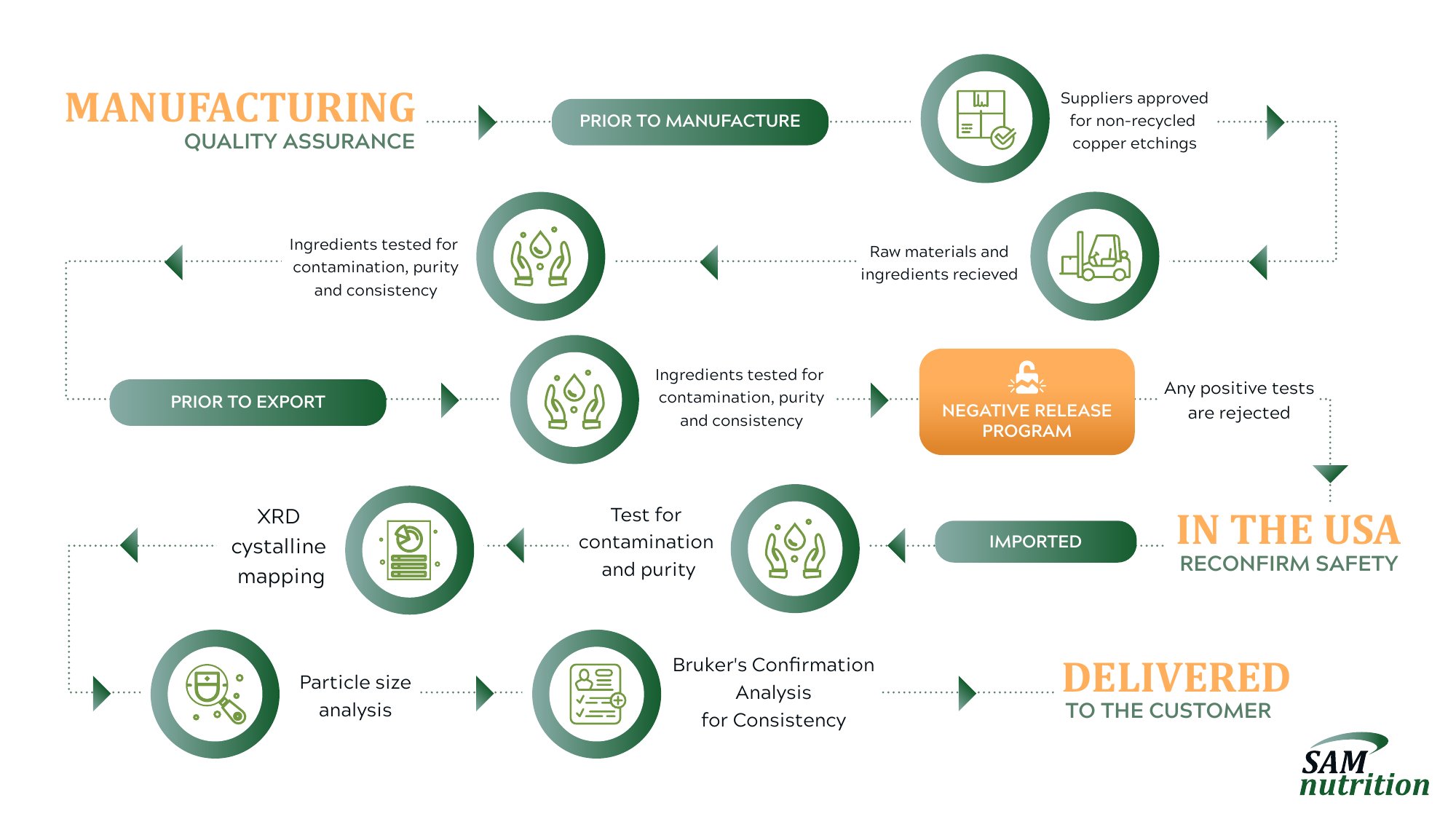
The objective: explain a multi-stage lab testing process for a trace mineral product, from supplier approval to customer delivery, to an audience that wants the technical detail but not a 10-page spec sheet.
What I did: mapped 12 steps into three phases (manufacturing, prior to export, and in the USA) along one continuous path the eye can follow. Every testing step has its own icon. The one decision point, the negative release program, gets its own color, so the moment a failed test is rejected stands out from the rest of the flow.
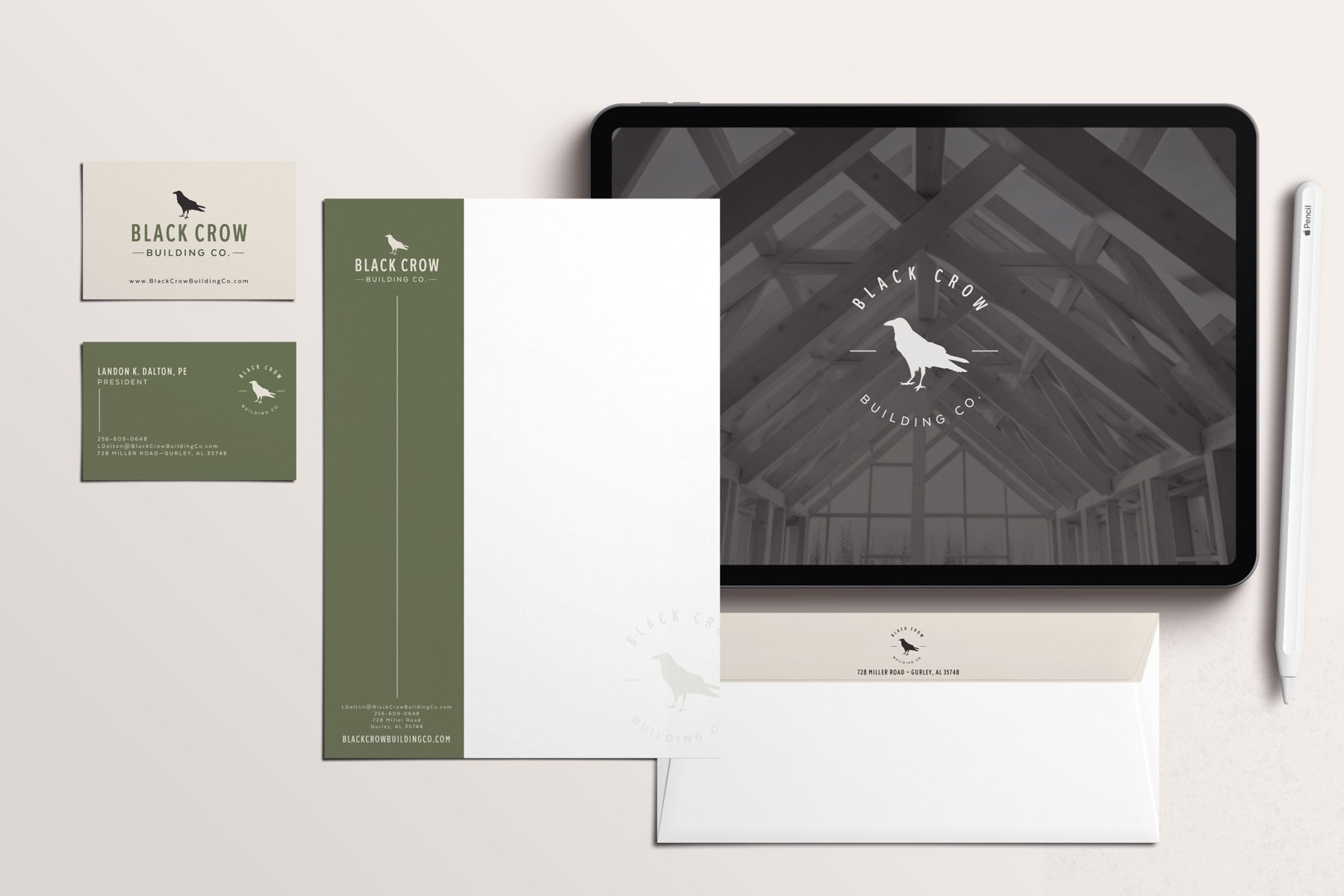
Black Crow is a Huntsville custom home builder that came to Huntsville Design House as a new business with no identity. I created the brand from the first logo sketch, then built the system around it, from stationery and social templates to the sales materials for each home they list. It's the clearest example of how I take a visual idea from concept all the way through production, then keep it consistent across every place it shows up.
The objective: give a brand-new builder an identity that feels established and trustworthy, flexible enough to work on a jobsite, a hat, a letterhead and a phone screen.
What I did: designed a condensed wordmark with a crow silhouette, plus a circular badge and a standalone icon for small and square spaces. The palette (deep olive, warm stone and charcoal) is earthy without reading “rustic.” I carried it into a stationery suite with a full-height color band on the letterhead that echoes the website and social templates.
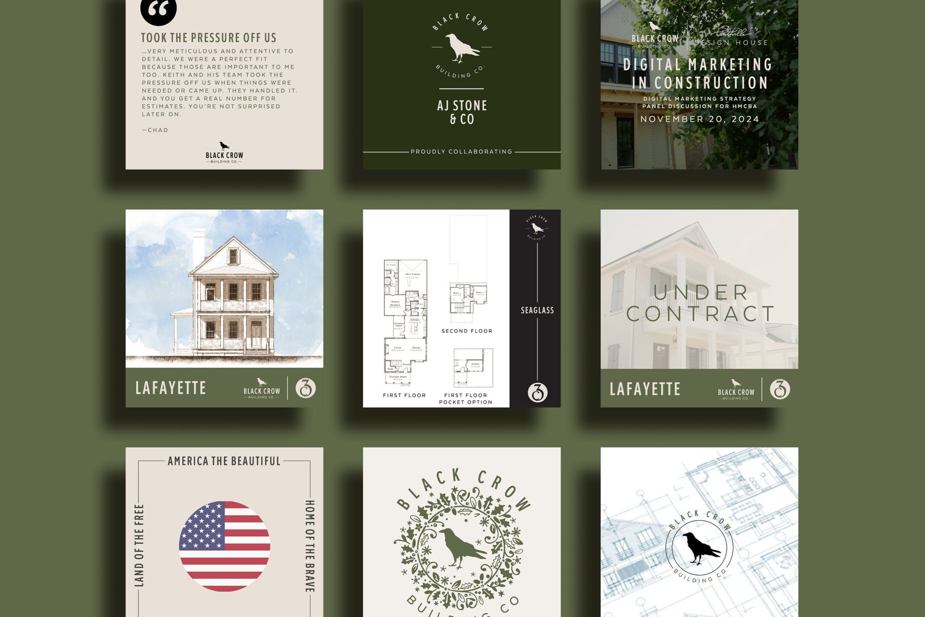
The objective: keep a steady stream of posts (listings, sold homes, testimonials, events) looking like one brand, even when the builder posts them himself.
What I did: built a template family: testimonial cards, “Sold” and “Under Contract” overlays, listing tiles that pair the architect's watercolor rendering with floor plans, partner announcements and a co-branded event graphic. Each uses the same type, color band and logo lockup, so the feed reads as a single system.
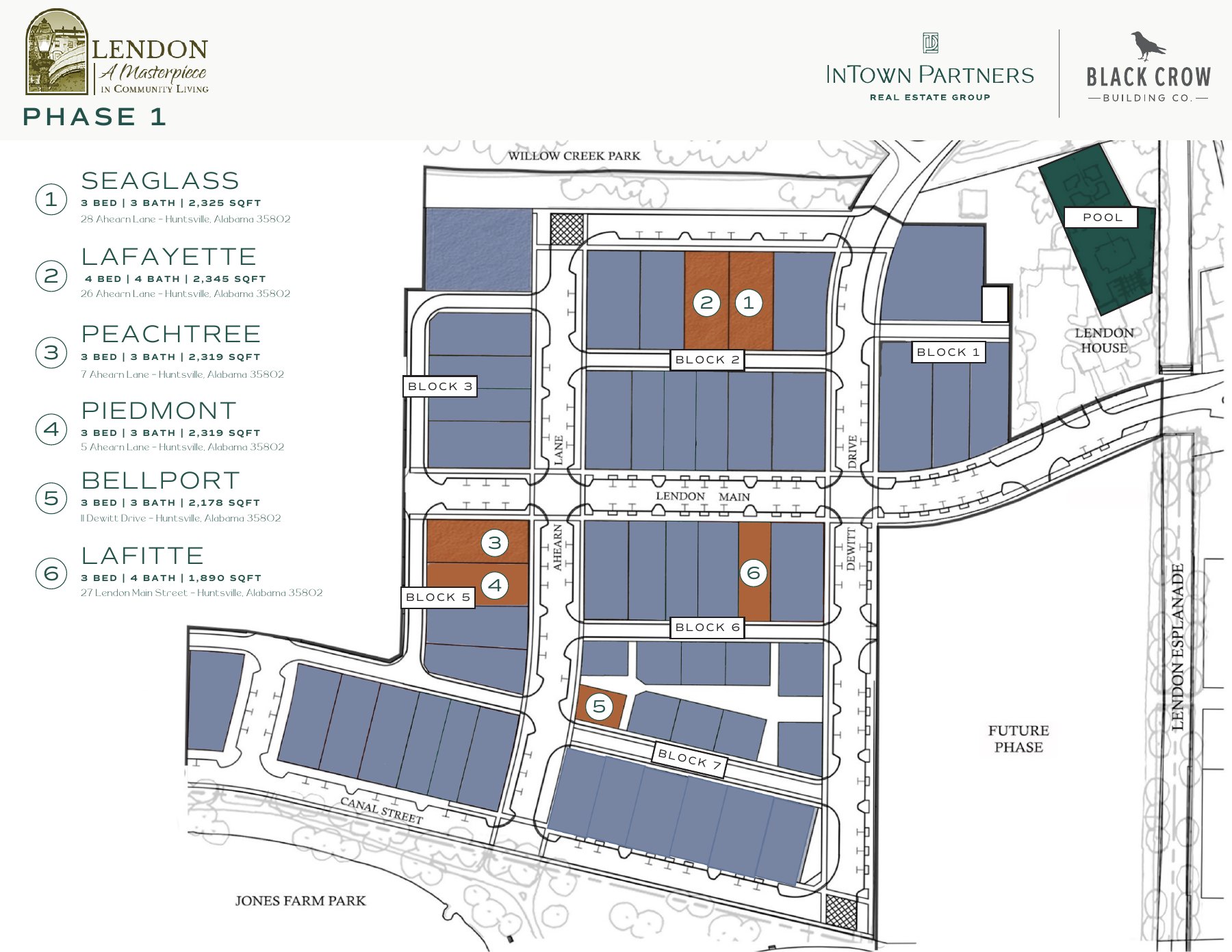
The objective: show buyers which homes are available in a new neighborhood, where each one sits and how they compare, on a single page.
What I did: turned the development plat into a clean, color-coded site map. Available lots are numbered in the builder's accent color against muted blocks, streets and parks are labeled, and a matching key lists each home's name, beds, baths, square footage and address. It's co-branded with the developer's real estate partner, so both identities share the header without competing.
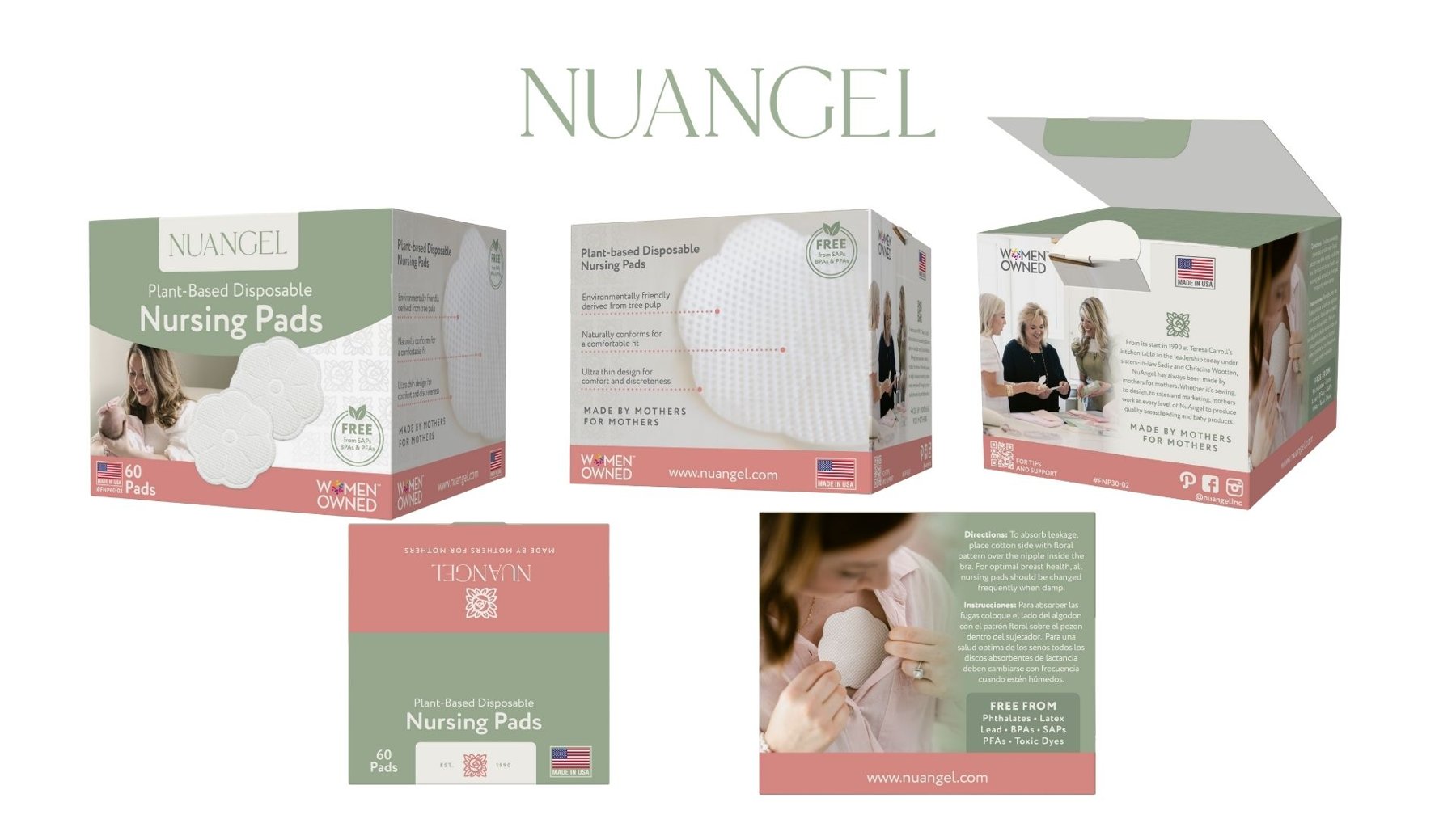
Packaging is the most production-heavy work I do. Every panel has a job: shelf impact on the front, proof points on the sides, then directions, regulatory language, compliance icons, SKU numbers and a barcode on the back. It all has to fit a printer's dieline with no room for error, and the copy has to be exactly right.
The objective: a consistent family of packages for a women-owned, made-in-USA baby products company. They needed to stand out on a retail shelf and carry a lot of required information without looking cluttered.
What I did: built a packaging system in the brand's sage, blush and cream: a curved color band holding the product name, lifestyle photography on the front, a callout panel with dotted leader lines pointing to product features, and the company story on the back. Bilingual directions, “free from” claims, Made in USA and Women Owned marks, SKU numbers and a QR code to support content are all placed to the dieline so every SKU in the line follows the same layout.
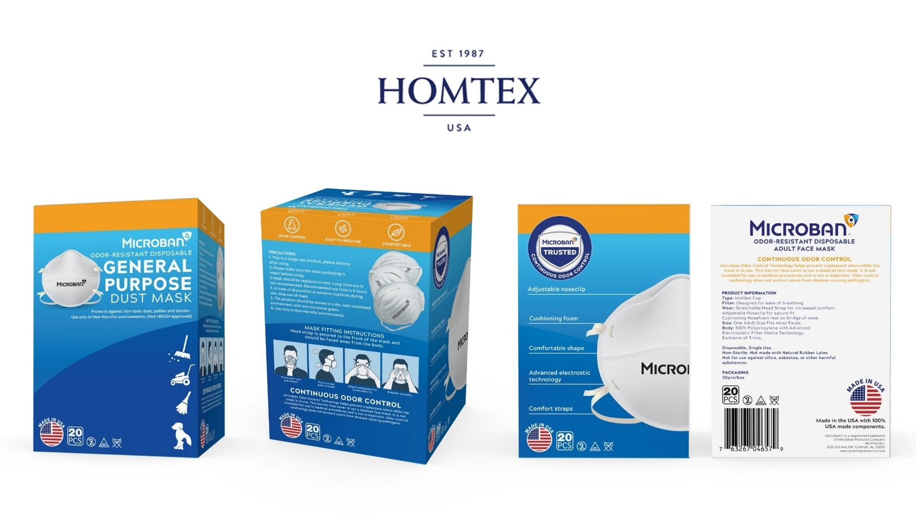
The objective: packaging for a licensed Microban product made by HomTex. It had to follow the licensor's brand standards, explain proper use clearly, and state exactly what the product is and isn't approved for.
What I did: designed the carton in Microban's blue and orange, with use-case icons on the front and a four-step illustrated mask-fitting sequence on the side. The required precautions and disclaimers (not NIOSH approved, not a medical device) appear in plain, readable type. The back panel has the product specifications, recycling and safety icons, the Made in USA seal and the UPC barcode.
I've been designing for over a decade, and I truly love what I do. Every day I get to help clients take their hard work (their thinking, their research and their processes) and turn it into visuals people can understand, trust and act on.
Thank you for taking the time to look through my work. I'd be glad to walk you through any of these projects, including the source files and how I set them up for print and digital production.